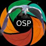
New OSP Logo: fully original & with a touch of green
Open Source Photography finally has its own face – for real this time. I figured it was about time for a logo that truly fits OSP, without needing to credit other designers. So, using a design that started with AI (cheers Jarvis 😉) and a photo of myself, I created in Gimp 2.10.25 (yep ! the older version) a fresh, new logo. It’s now live as both the site icon and the main logo in the header.
What makes it special? Instead of the usual aperture blades, I swapped them out for little tree leaves. It gives the whole thing a more natural vibe, while still keeping that subtle nod to photography and tech. Just like OSP itself – a blend of nature, creativity, and open source spirit.

Discover more from Open Source Photography
Subscribe to get the latest posts sent to your email.


It’s a brilliant logo, I like it 👌👌👌
LikeLiked by 1 person
Thank you so much, Mark, I really appreciate it! I think it turned out really beautiful too 🙂
LikeLiked by 1 person
Beautiful and nice Colors!
Oei schrijf nu Engels 😀
LikeLiked by 1 person
Haha ! Dankjewel Joke !
LikeLiked by 1 person