
6 minutes read.
Well, I said I was pretty happy with this quick and simple edits – and I meant it. Honestly, in most cases I’d just throw this kind of result straight into my gallery without chasing perfection.
But… can it be improved? Sure.
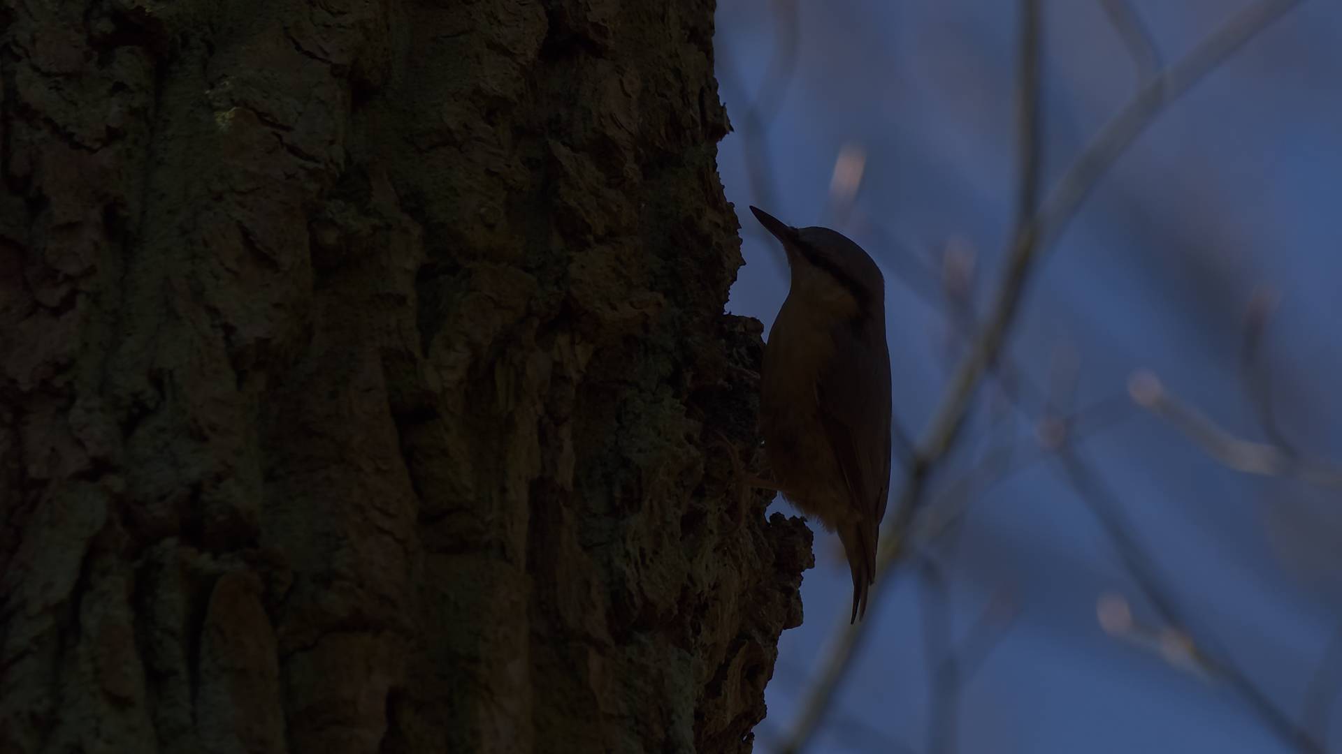
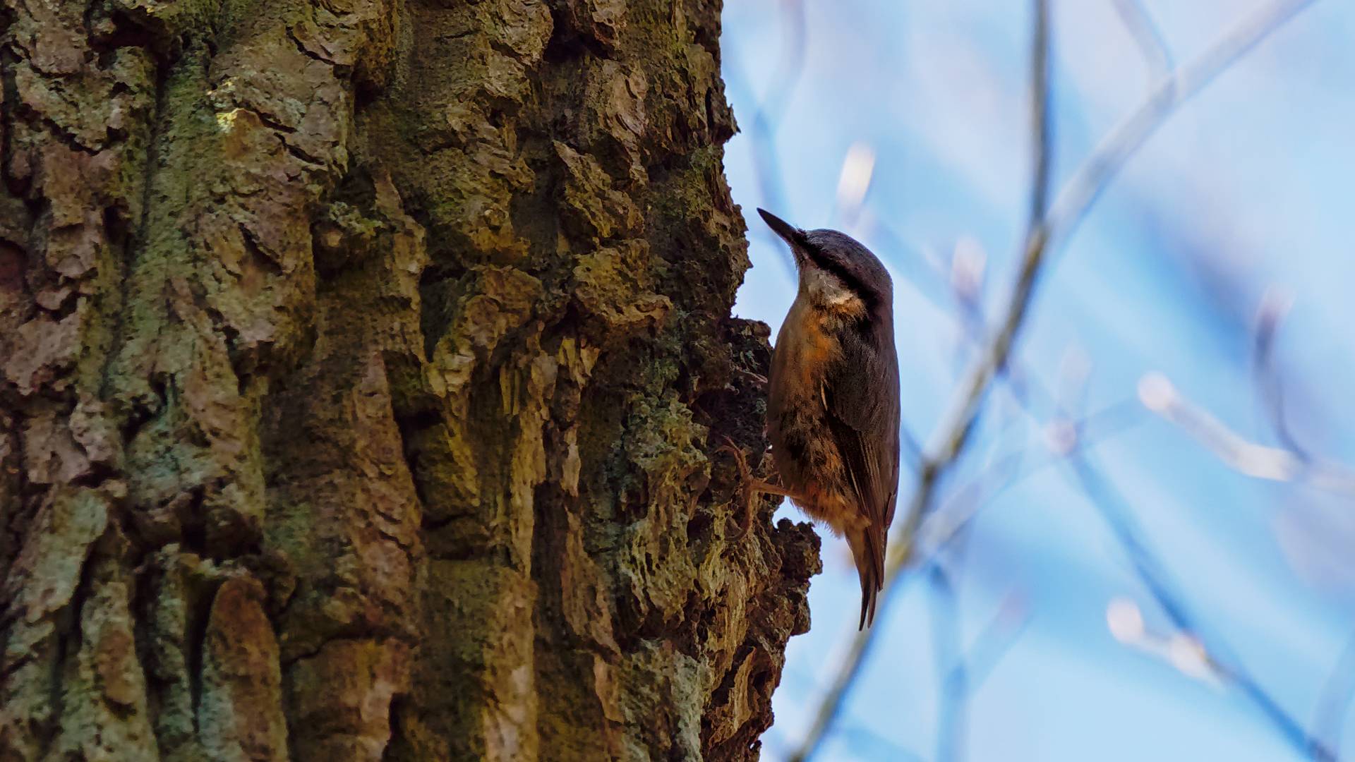
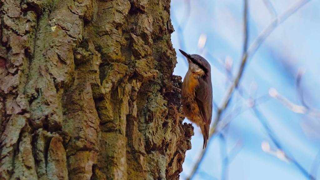
In my first version, I used Shadows & Highlights to bring the bird out – but of course, that affects the whole image. Going further would’ve made everything too bright unless I started fiddling with contrast and color globally. No thanks.
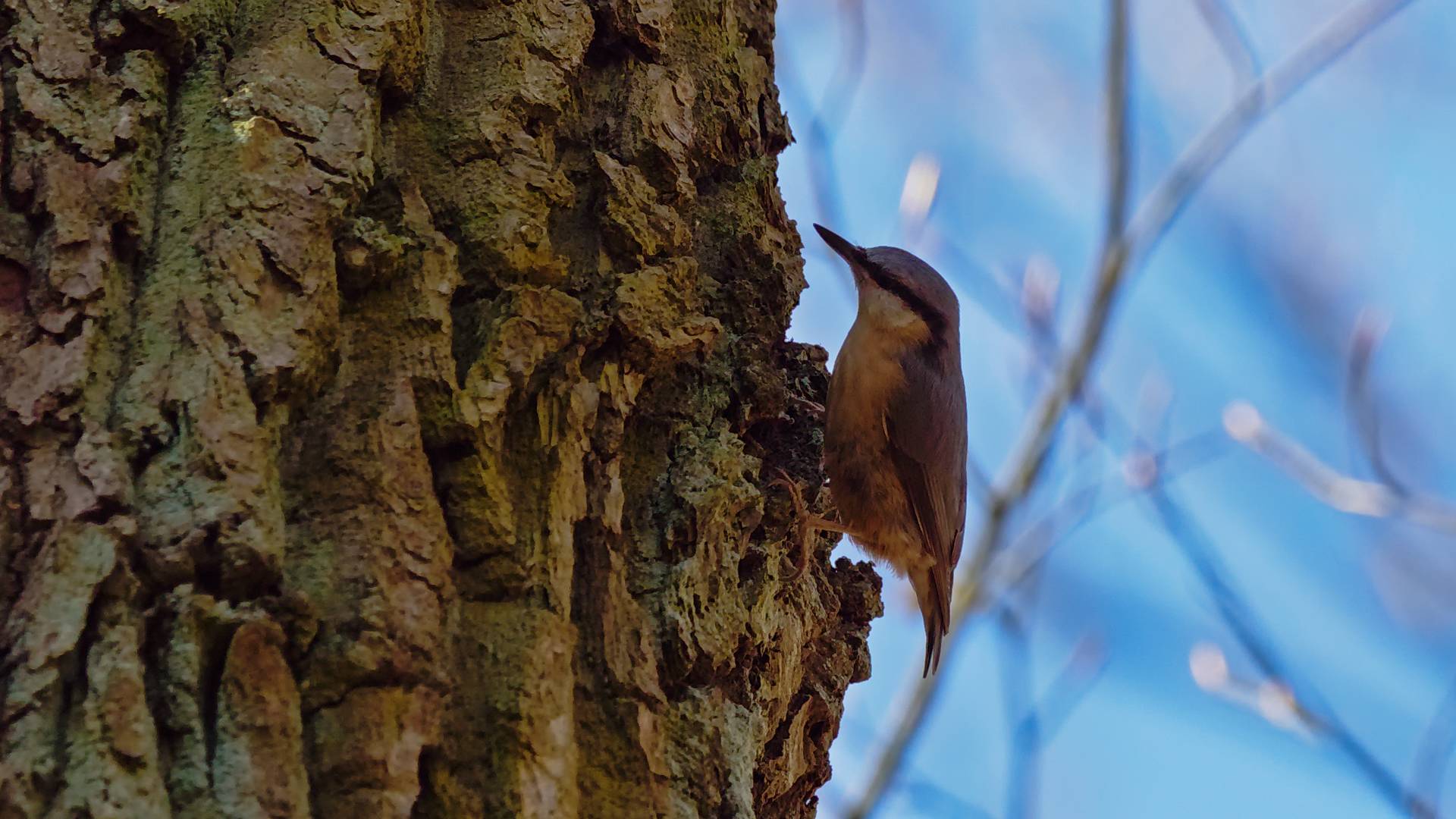
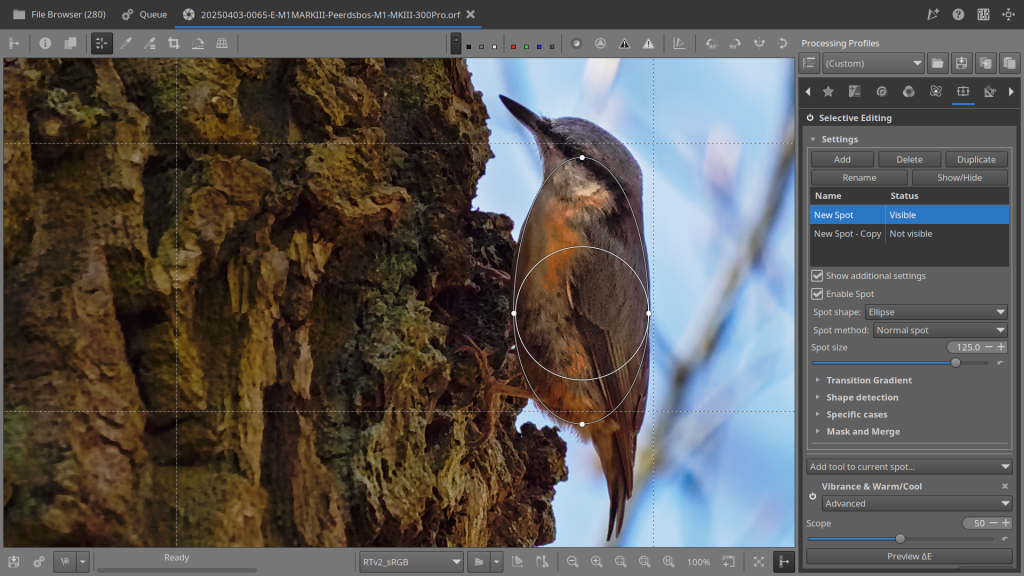
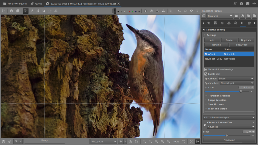
S&H did its job nicely – all that was left was to give the bird itself a little extra pop – That’s where Selective Editing came in : one large spot on the body, one small on the head.
The body got light Tone Mapping and a touch of Vibrance to warm it up.
Just a hint of Tone Mapping on the head — done!
Well, it wasn’t that quick and done — the version you see here is actually number 11. And over on La Gallerie, you’ll find version 12. I did this on purpose, because that’s how I usually work in my RawTherapee workflow: I often create multiple versions of the same photo, each with its own sidecar profile (.pp3), so I can always go back to any previous state if needed. RawTherapee can automatically add a suffix to your output files, so version numbering happens by itself. Just make sure to check the “Add suffix” option in the Save dialog — that way, each saved version gets a unique name without any extra effort.
Here below a YouTube Short about this edit – click on the picture to see the effect before and after :
Sometimes, I’ll make small, subtle changes — and then compare the result to an earlier version. In this case, version 12 was that refined step. By keeping all the .pp3 files along the way, I can keep building on any of those edits whenever I want.
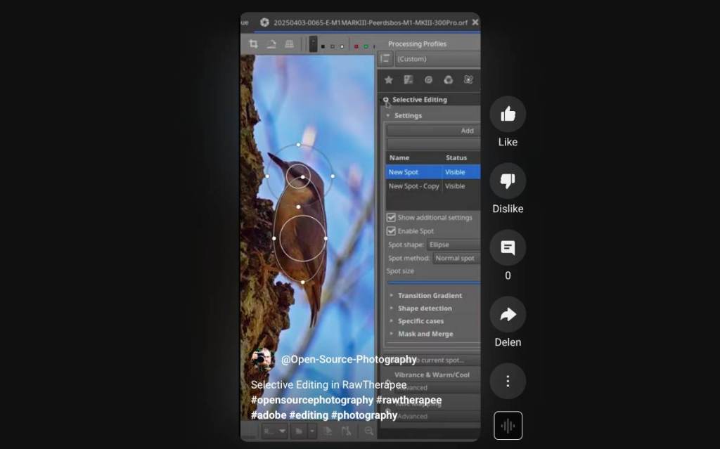
For this image, I used two spot masks. Each spot focused on enhancing specific tonal characteristics in localized areas of the scene.
🔹 Spot 0 – Local Contrast Boost – Body
This spot was applied to subtly enhance local detail and contrast:
- Tone Mapping was enabled with a moderate Strength (0.5) and a slight Gamma adjustment (0.61) to bring out midtone structure.
- Exposure correction was increased by +1.4 EV within the spot to lift shadow regions.
- Sensitivity and Amount were both pushed high to maximize local detail without flattening.
- Vibrance was also enabled, though set to neutral values (Pastels: 75, Saturated: 75) — ensuring color richness was preserved without introducing a color cast. No warm/cool shift was applied.
🔹 Spot 1 – Stronger Tonal Enhancement – Head
This spot was used for more pronounced tone shaping:
- Tone Mapping was applied more aggressively (Strength: 0.75) with default gamma and similar +1.4 EV exposure correction.
- Like the first spot, Amount and Sensitivity were kept high to reveal local texture and structure.
- No vibrance or color adjustments were applied in this spot.
This combination of localized tone mapping and controlled vibrance helped bring out texture and depth in targeted regions of the image, while maintaining a natural look overall.
It may seem like there’s little difference, but subtlety is key here. People tend to overdo it with this kind of editing, and unfortunately, that doesn’t make the image any better. So, small adjustments and careful evaluation are really important. In the end, you should end up with something like this photo, and maybe it can be just a little bit better, but remember where we started from—this photo was nearly all black!
Now, if you’re used to Adobe Lightroom and not exactly thrilled by RT’s version of these tools – don’t worry. RawTherapee keeps evolving. It may not have all the fancy bells and whistles (yet), but it’s growing. Just like your editing skills.
Hope you picked up a useful tip or two – and I’ll catch you in the next Open Source tutorial!
🛠️ Tools available in RawTherapee’s Selective Editing (Local Adjustments):
This part of the article is for those who want to know a bit more about the tools currently available in Selective Editing. Here’s a brief summary:
- Tone Mapping
– Apply local contrast enhancement, similar to HDR tone mapping. - Vibrance / Warm-Cool
– Adjust saturation with separate control over pastel and saturated colors. Includes a warm/cool color shift slider. - Color Toning (Split Toning)
– (May depend on the build) Add local color casts to shadows and highlights. - Blur / Sharpen
– Apply local blurring or sharpening for softening or enhancing detail. - Denoise
– Reduce noise in specific areas of the image. - Exposure & Contrast
– Locally control exposure, contrast, gamma, and related tonal adjustments. - Detail Extraction
– Enhance micro-contrast or texture in selected regions. - Lab Adjustments*
– Modify luminance and color through the L, a, and b channels. - Curves (RGB & Luma)
– Apply RGB or Luma tone curves locally for precise tonal shaping. - Blending Masks
– Advanced masking tools based on luminance, color, or texture to define how each spot is applied.
And specifically, a bit more about the tools I used for the photo of the nuthatch:
🎚️ Tone Mapping – Local Adjustments Tool
This tool allows you to compress highlights and boost shadow detail locally, simulating an HDR-like look or enhancing local contrast in a more natural way.
🔧 Settings explained:
- Strength
Controls the overall effect. Higher values produce a more intense tone mapping look. Typical range:0.3–0.7for subtle results. - Gamma
Adjusts midtone brightness. Lower values darken midtones, higher values lighten them — helps shape the tonal curve in affected areas. - Exposure Correction
Local EV shift (positive or negative). Can be used to brighten or darken the masked region before tone mapping is applied. - Amount
Affects the overall intensity of the tone mapping. High values increase contrast and detail; low values soften the effect. - Sensitivity
Determines how much the tone mapping algorithm reacts to edges and contrast. Higher sensitivity preserves more detail but may enhance noise or halos.
🎨 Vibrance / Warm-Cool – Local Adjustments Tool
This tool is designed to subtly boost (or reduce) saturation and adjust color temperature in a more natural and controlled way than global saturation.
🔧 Settings explained:
- Enable Vibrance (
Expvibrance=true)
Must be enabled per spot to activate the vibrance tool. - Pastels
Controls how strongly less saturated (pastel) colors are affected. Higher values make pastel tones more vivid. - Saturated
Controls the vibrance effect on already strong/saturated colors. Helps avoid oversaturation. - Vibrance Gamma
Adjusts how vibrance is applied across tonal ranges. Affects the “curve” of vibrance application — default is usually1. - Warm/Cool
Shifts the color temperature of the selected area:- Positive values → warmer (more red/orange)
- Negative values → cooler (more blue/cyan)
Useful for correcting or creatively shifting local white balance.
This article was written by Marc R.
While I primarily speak Dutch and have some knowledge of English and a little French, ChatGPT helps ensure my writing is grammatically correct. I often mix Dutch and English in my drafts, and ChatGPT steps in to translate and correct.
I don’t have any Sponsoring Companies, Patreon support, or Follower Donations.
I don’t drink Coffee, well, I do … but not the financial form you sometimes find on other websites, like ‘buy me a coffee’ 😊
However, what I truly need to keep going is Motivation, and the best part is, it won’t cost you a thing. You can offer it for free – just hit the Like button and Subscribe !
Discover more from Open Source Photography
Subscribe to get the latest posts sent to your email.


These guides to Rawtherapee are great. Very instructive and easy to follow.
Keep them coming.
LikeLike
Hey Colin, thanks so much for your kind words, and welcome to OSP!
I’ve always been a big fan of RawTherapee – such an underrated gem.
I try to approach everything with an open mind, just testing and sharing my thoughts.
With my reviews, I hope to give it the recognition it deserves.
All I ask in return is a simple like & subscribe – the more support,
the more motivation I get to keep going.
Honestly, there were times I thought about quitting because it felt like no one was watching.
So really – thanks a lot, Colin. Hope to see you around!
Marc.
LikeLike
Interessante uitleg Marc
prettige avond
LikeLiked by 1 person
Dankjewel Willy – fijne dinsdag !
LikeLike